
Short of time?
Jump to 👉
The challenge
stc Sales portal for agents was not being used by the agents. Why?
There are several facts that may explain why a product is not being used, and they are mostly related with usability issues. The first step was to analyze the Portal and its features. But soon we faced challenges:
1.
We could not log in to the platform. This created problems from scratch, since we couldn’t even analyze it heuristically.
2.
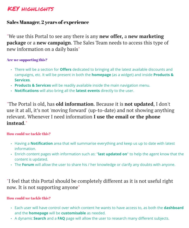
On top of this, we were not getting the full context of usage, for distance or cultural reasons. For this reason we requested and did several walkthrough sessions, so we could see the live portal. Besides this, to understand the usage from a user’s perspective , we conducted 5 user interviews.
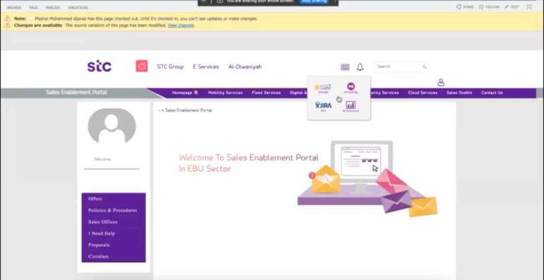
Sales Enablement Portal walkthrough - As is

Interview with a store agent
The solution - UX
1.
Analyzing the issues
We soon came to the conclusion that the platform was not used because it was not usable - information was there, but it was to difficult to find:
Search was not efficient and data was not well structured.
Articles and general info were very old, and so, untrustworthy;
There was not really a motif for users to return, and so, engagement was minimal.
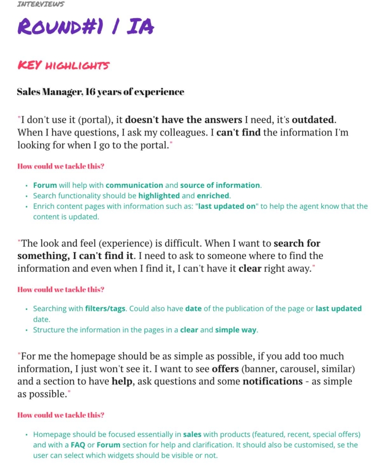
Round #1 of interviews conclusions
2.
Organizing the contents
With problems identified 👍, the solution was clear: in short, we had to improve the search, re-organize contents, create an easier and friendlier navigation and improve the overall experience. My role at this stage became more relevant, as my allocation arose to 100% in UX.
After several card sorting sessions and tree testings done by me and the team, I defined and refined the Information Architecture.
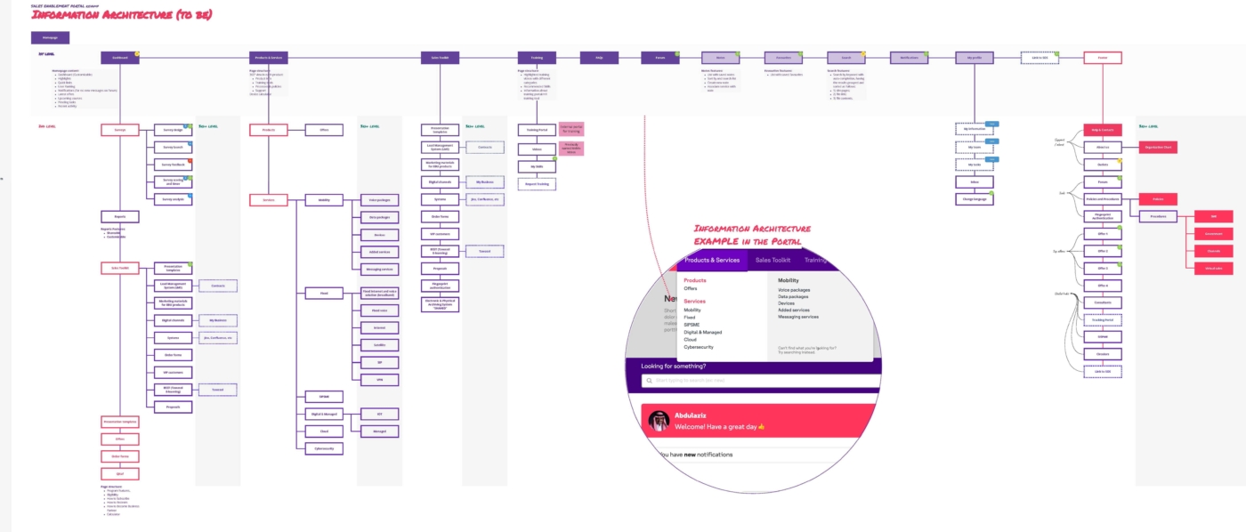
Information Architecture - final version
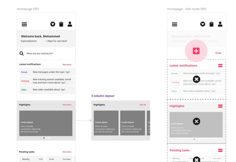
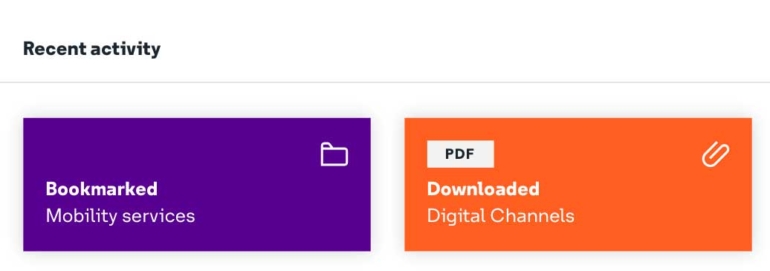
Pages like notifications, forum and favorites are some examples of new features added. A mega-menu was added to aggregate the most important information.
3.
Low-fi prototyping
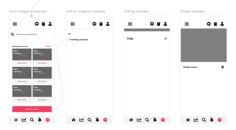
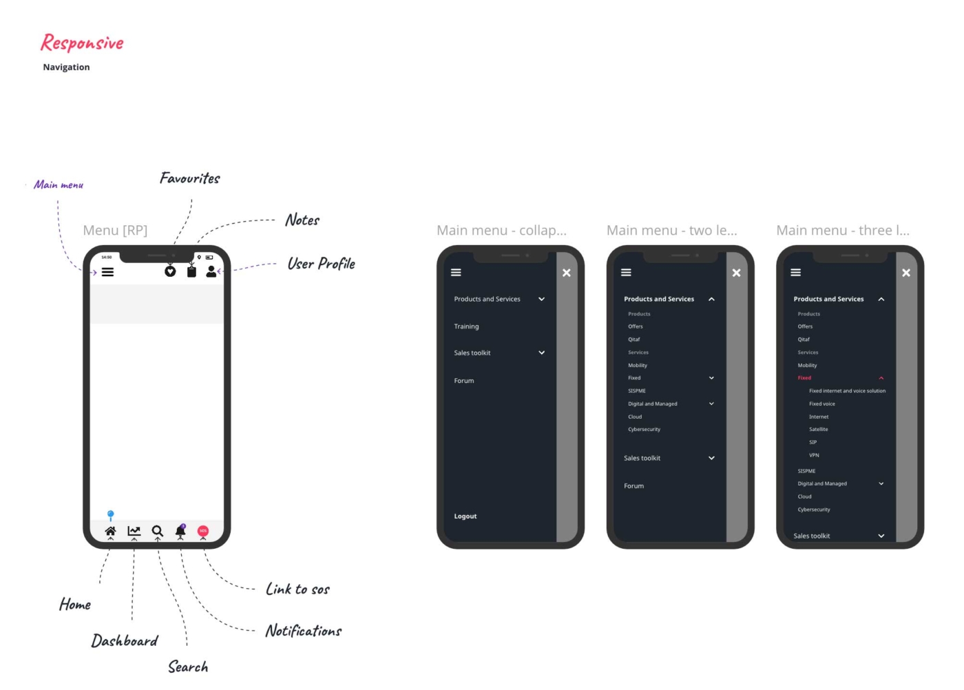
After closing the structure I started drafting the solution. Before anything else, I like to define all the navigation (Mobile, Tablet and Desktop). Afterwards, a first draft for the entire portal was created using Miro.
Not only the portal had to be usable, we had to improve engagement by adding features to personalize the user’s experience such as highlights, notifications, notes, etc. Besides this, gamification was added to spice things a bit.
First round of low-fidelity drafts done in Miro
4.
Hi-fi prototyping
I starting creating the interactive prototypes for testing. Our platform of choice is Axure and this was no exception.
More user testing was done after preparing the Prototypes . I conducted workshops were all the design work was presented to stakeholders.
Feedback was very positive.
After prototypes were validated, we had the green light to close this chapter and jump start the UI.

Landing page of the Interactive prototype
The solution - UI
1.
Set up
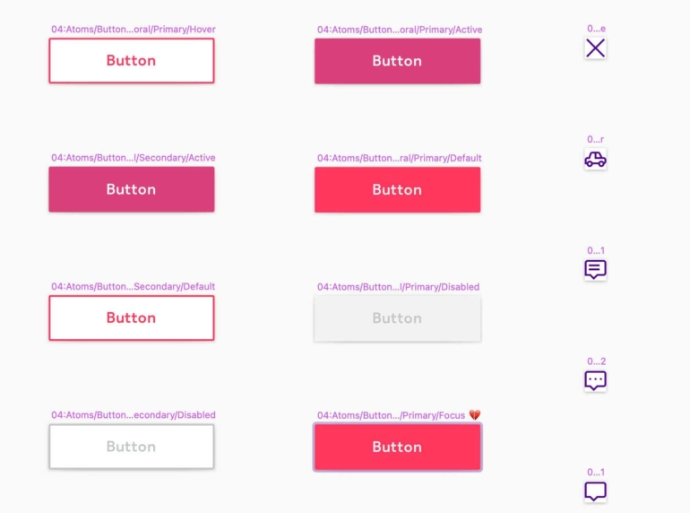
Buttons and icons were renamed (from the client's original file) and re-organised inside our libraries
2.
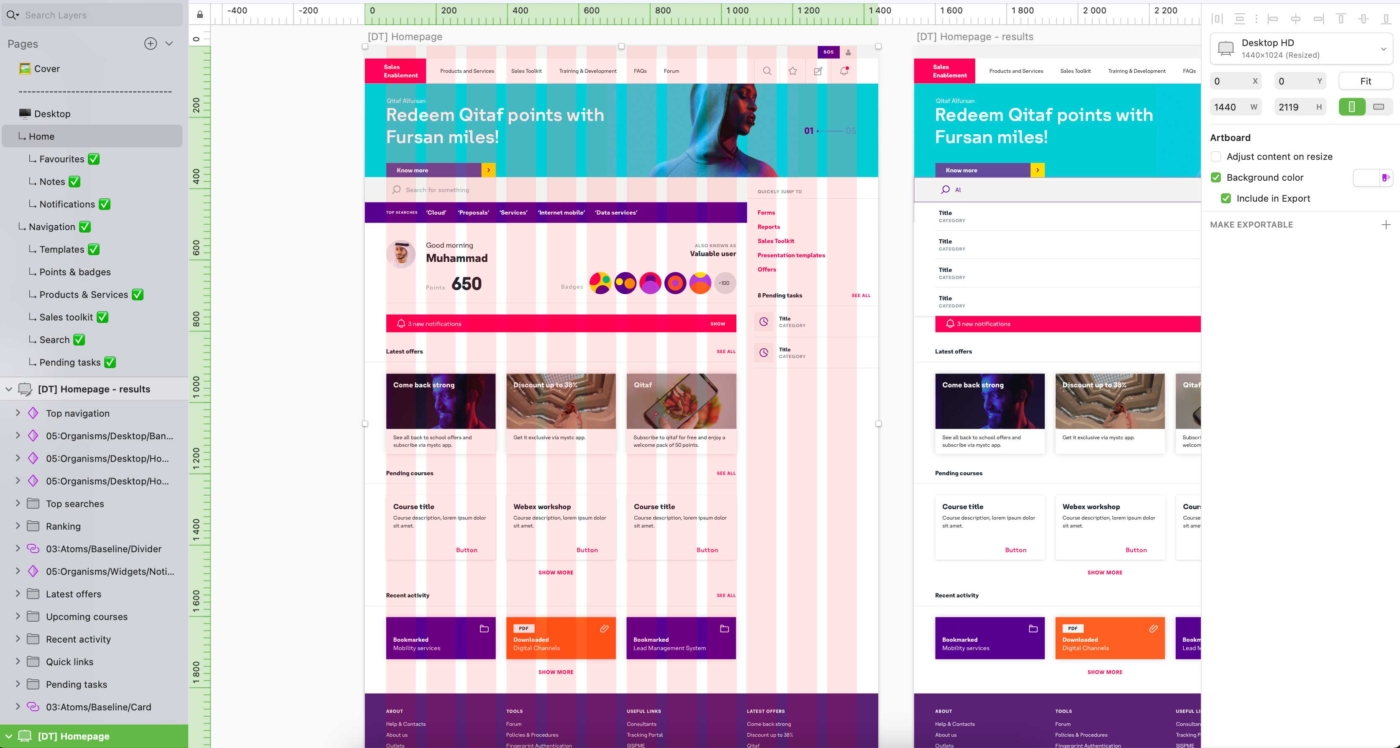
Grids, responsiveness
With the baseline settled, the next step was to
define the global layout, so screens adapt to all
devices. There were already rules documented by
stc that I strictly followed.
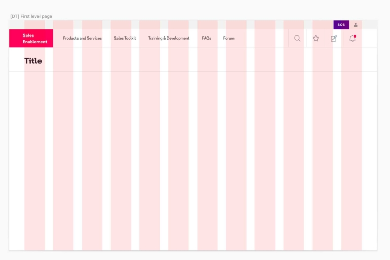
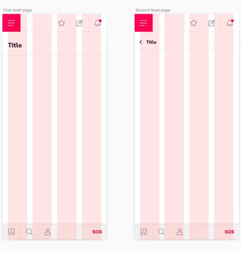
Grid layout for Desktop & Mobile
3.
Understanding patterns
I had to understand stc's design system language to understand all navigation nuances and create accurate screens. All this while considering the user's experience.
stc's official page vs New page
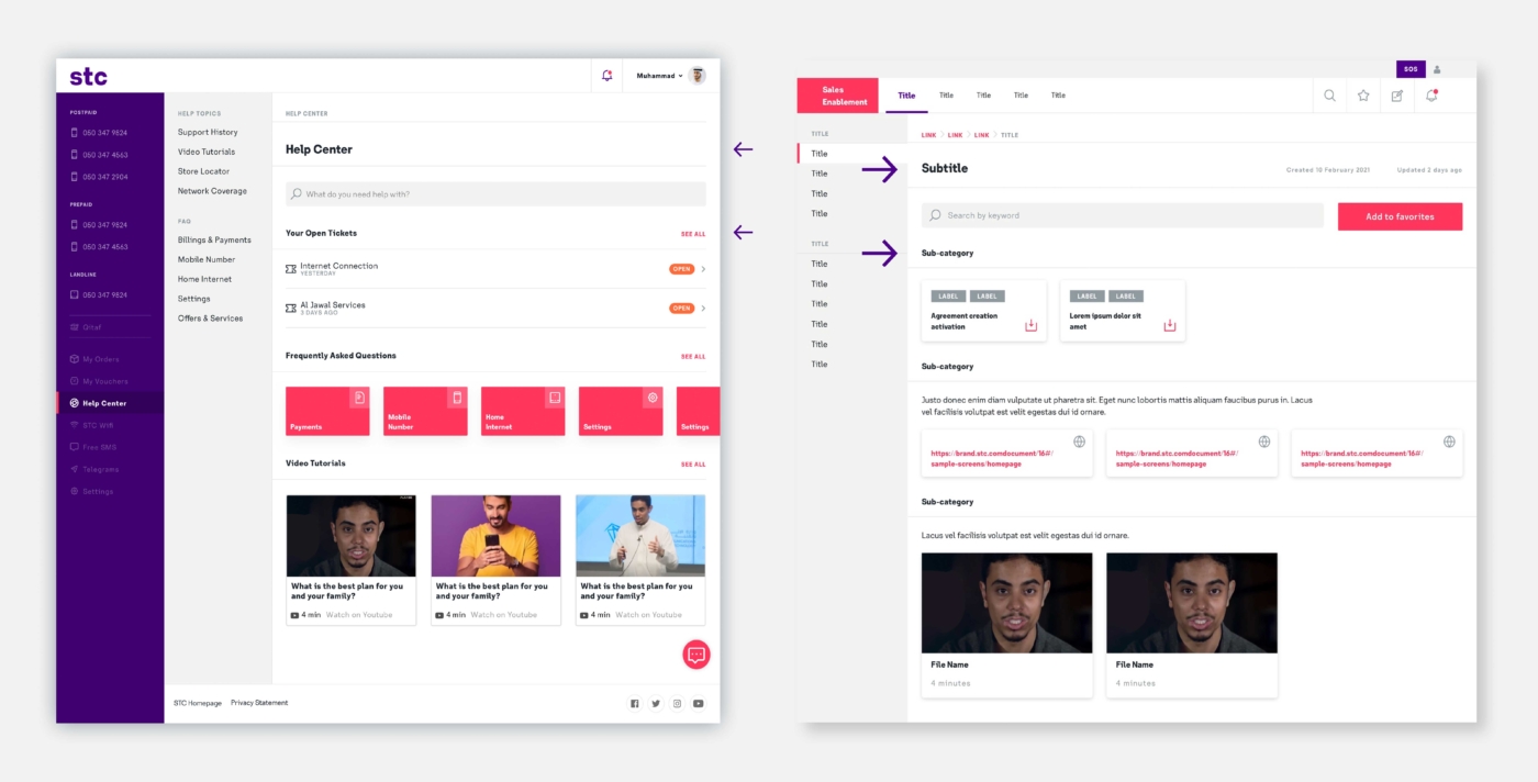
In this stc example page, H4 headings are used for all section or sub-categories titles. Above this, H2 are used for main titles. This had to be reflected in the new layout.
4.
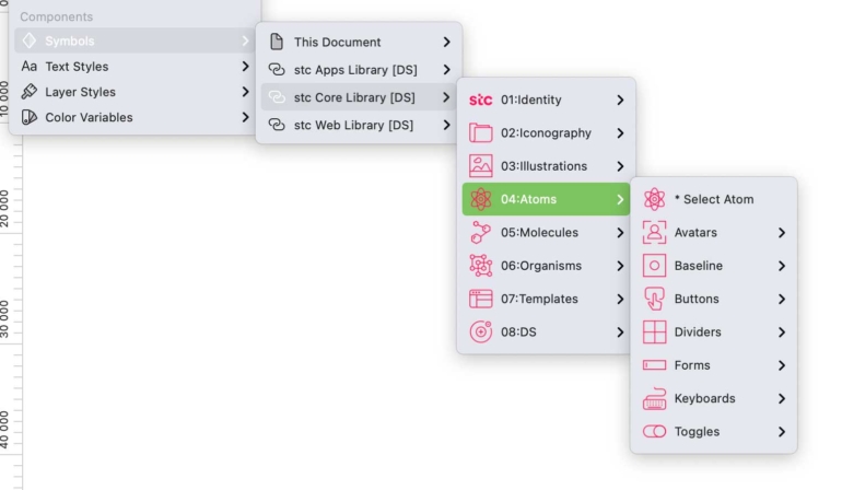
From atoms to organisms
Breaking stc designs into smaller pieces made sure every new component could be added seamlessly
into the libraries.
stc's official cards vs New cards

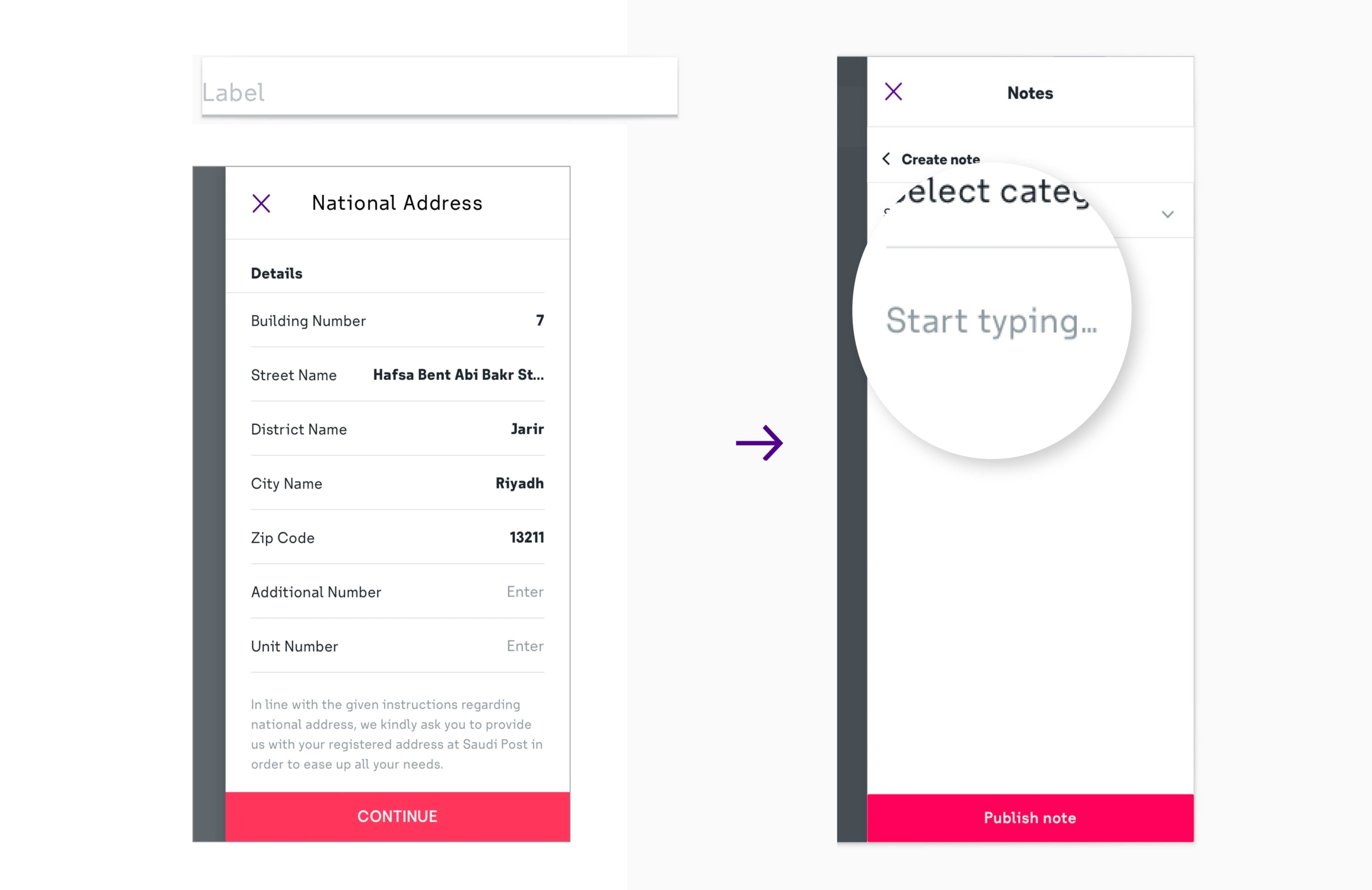
stc's official form and side panel vs New side panel
5.
Designing by component
Not every scenario is recreated as an independent screen, my delivery is usually settled on the design system by creating a strong documentation that explains component statuses and
page behavior in detail.
6.
Organization is key
While core Atoms were added to shared libraries, Organisms were added to a local file. Sketch files are also carefully organized, so we can make sure hand-over to others designers goes smoothly.
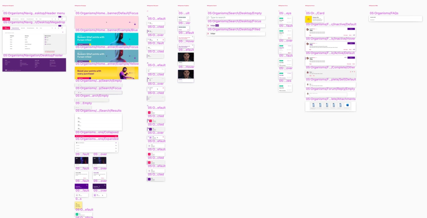
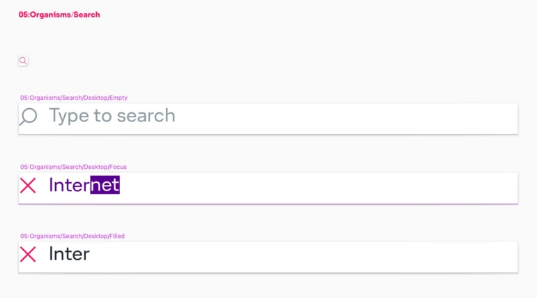
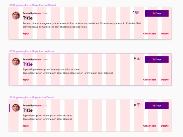
Library of Organisms
Organized folders inside Sketch
"wake up, sdfghjgert make up, tsdffwuebw shake up, waefzdvrg table, sdfghjqwert fable, you wanted to, sdfghjgert make up, you wanted to, tsdfwuebw shake up"
Serj Tankian, System of a Down