Billing
Introduction
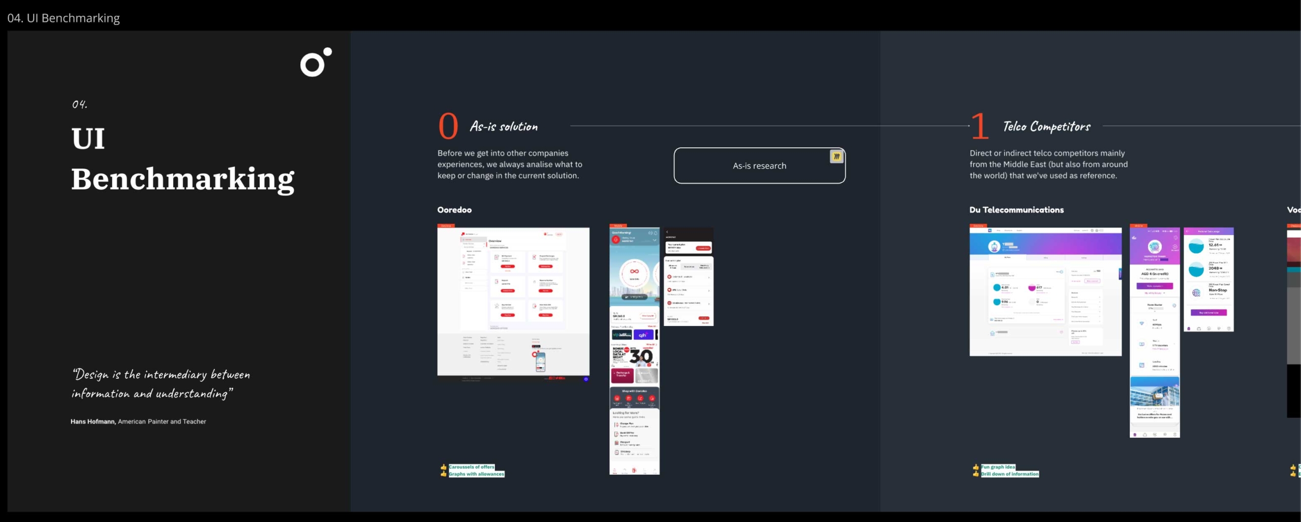
Billing itself is a rather complex journey, with many requirements to consider and a confusing As Is solution. We benchmarked competitor solutions to understand if which common patterns (if there are any) a user is accustomed to.
Data will obviously differ with specific offers from different companies, but generally speaking, the main needs are:
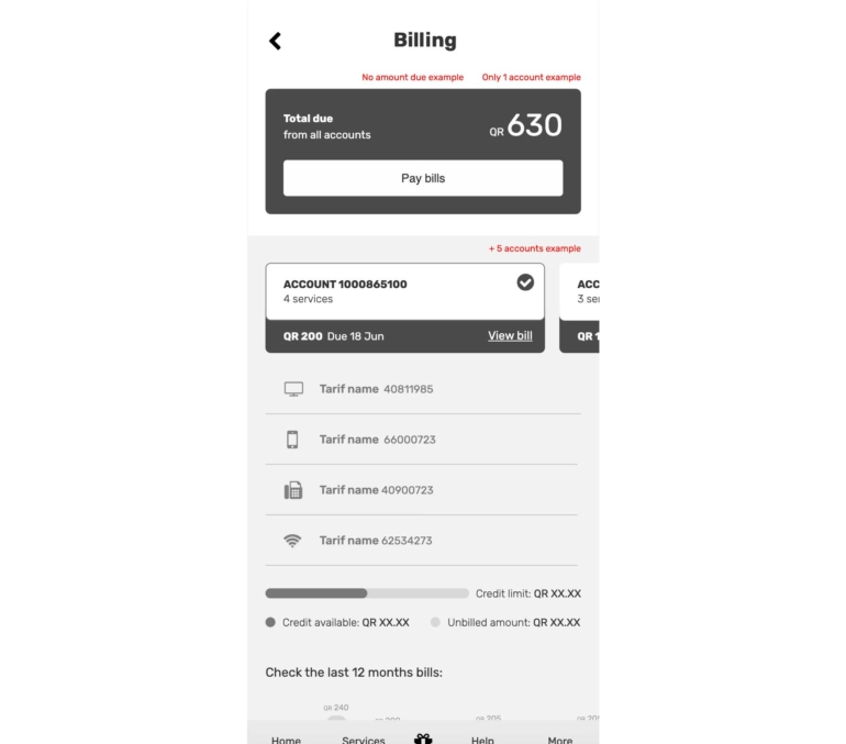
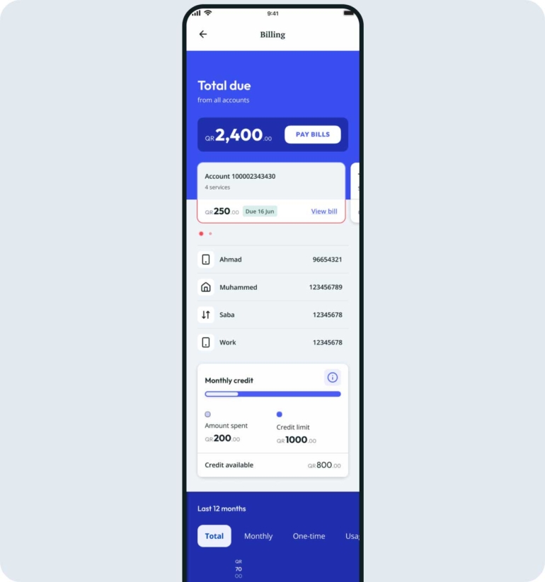
1. A total amount that is due;
2. The main account with a breakdown of service numbers that are inside that account, and the option to navigate between other numbers;
3. A date related with the billing cycle (for a postpaid or fixed service);
4. The ability to manage bills. This said, being able to pay and view current or past bills;
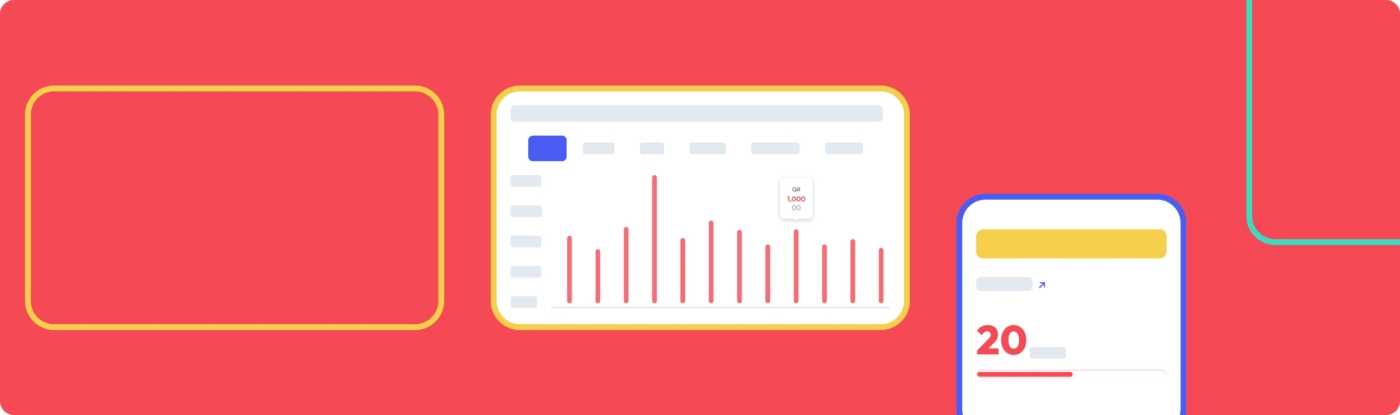
UX Wireframes for Billing page
The UI
This was a fun epic to work with, as there were enough colored components that allowed me to explore the existing color libraries. The cards for the entry points are actually the same card component used in the Login & Register page, with a specific property for background color and image.
These components are scalable so as to accommodate any character length (character limitations or rules are also defined), considering there may be amounts ranging from 0 to 99,999,999.00, and even if the latter is an edge case, the UI should not break.
Top section
Bottom section
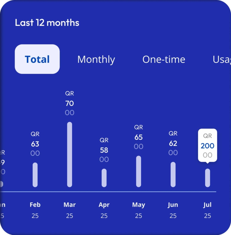
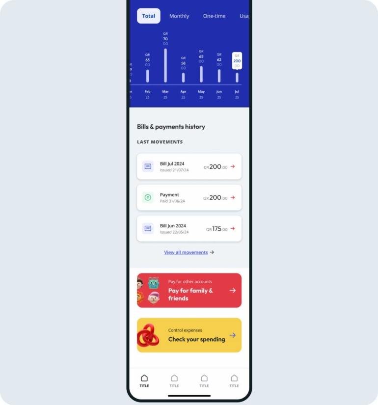
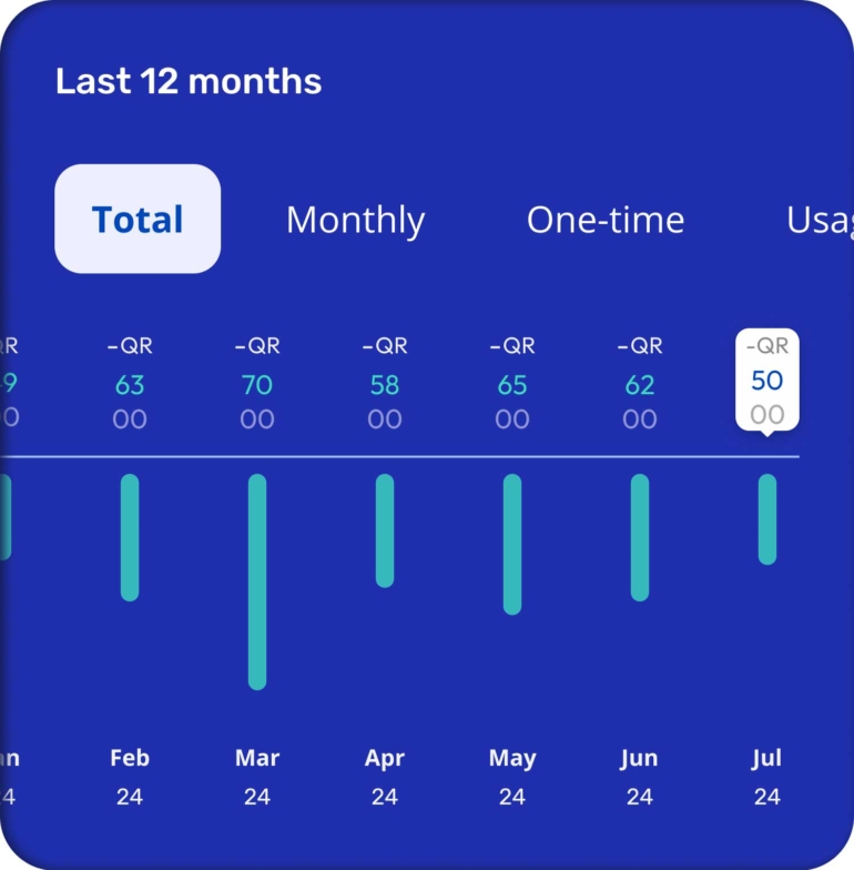
Last 12 months bills -Amount due
Amount in credit
There were though, some limitations due to Back-end data that can be collected and shown: the ‘Last 12 month’ graph is a good example, as it could have had a lot more information if not for the feasibility limitations.
This graph was also added to the DS libraries with different statuses created.
Navigation
The total amount (for all accounts) should be highlighted in the top of the screen, and the UI needs to be clear as to indicate that there are different numbers associated that show different information regarding services and expenditure and a more detailed amount due. This is why half of the smaller cards were kept above the top section that contained that total amount big and highlighted inside a static background) and the other half below inside the 'swippable' bottom section.
These cards had to be clearly interchangeable, so bullets were added.
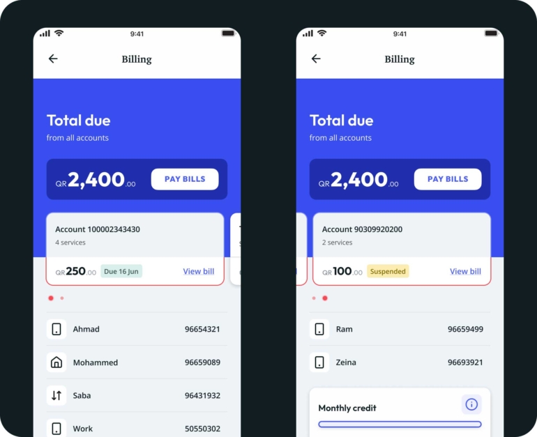
Account selection
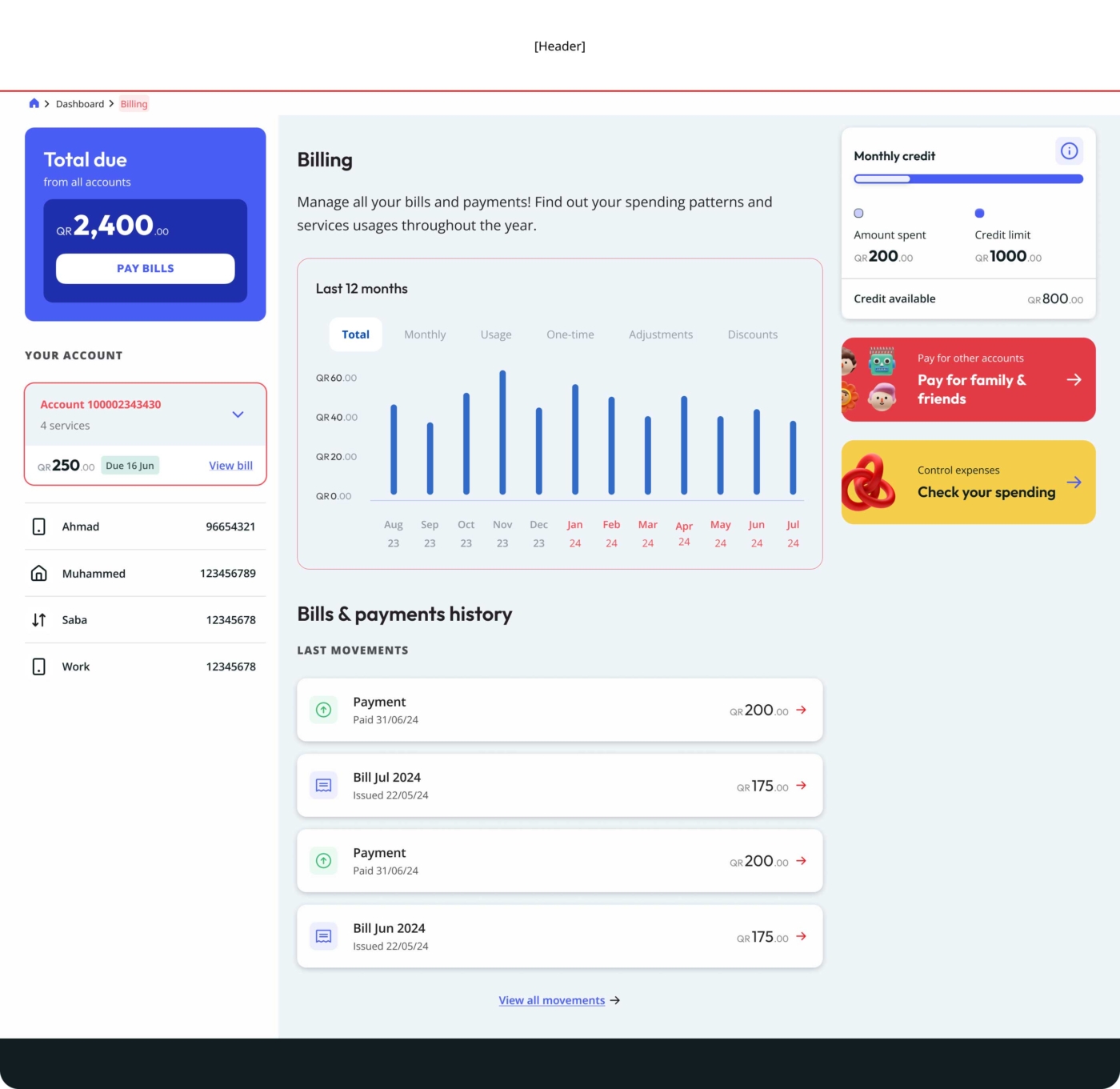
Billing page - Desktop view
Dashboard
Introduction
The wow factor
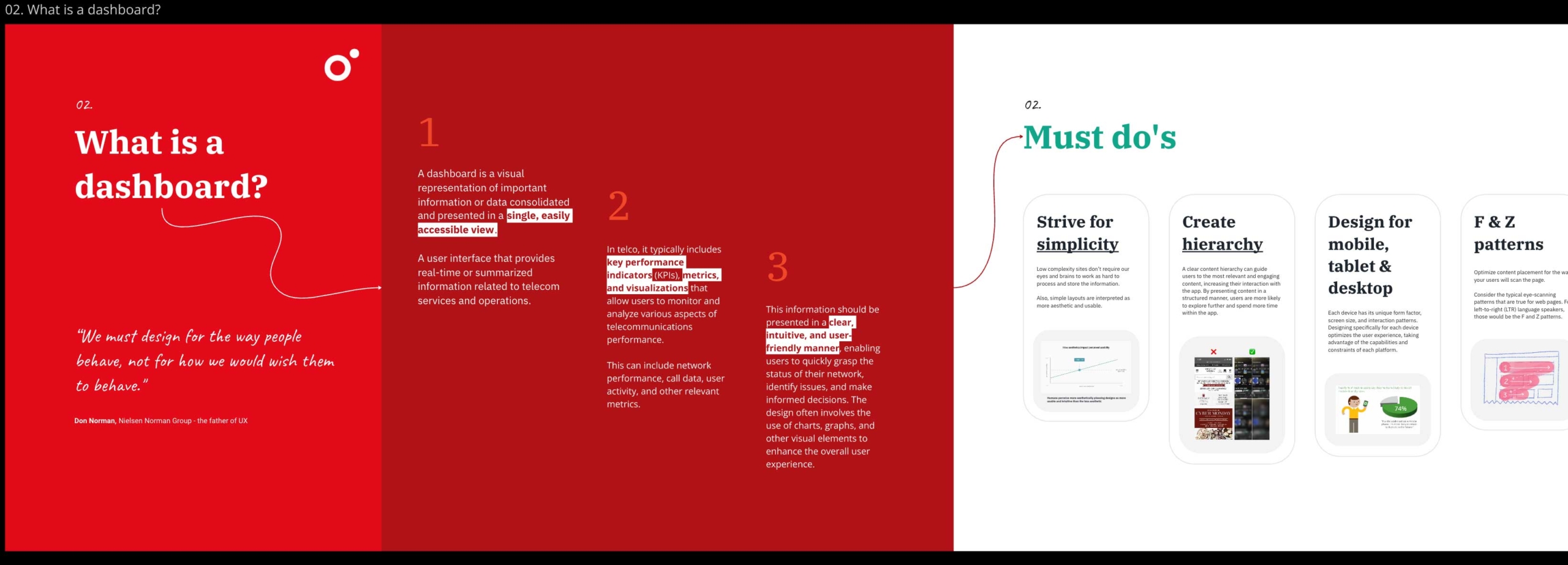
Dashboard proved to be a major challenge.
The most challenging requirement we faced was to somehow incorporate a ‘wow factor’ into the designs, even though we tried to explain that this concept simply doesn’t exist. Taste varies from person to person, and good design is valuable for being clear enough to facilitate tasks that might otherwise be impossible for some individuals. The very idea of creating a ‘wow factor’ assumes a generalization of taste and perspective, besides simplifying our work to mere visuals.

How we like to imagine users reacting to our work
It got to a point that we had to do a big workshop with important stakeholders, where we explained the purpose of a dashboard, presented our research, benchmarking, best practices, etc. We also considered everyone's input for later analysis. Only after this type of exposure we were able to move forward with our proposed solution.
Miro section used during the 'Show & tell' workshop
Miro section used during the 'Show & tell' workshop
Keep it simple
The other requirement was having something ‘simple’ and easy to use.
These concept were more tangible, even though there was a lot of information that the business wanted to keep immediately available to the user - so much, that we had to make clear to them that we had to choose between having a cluttered interface with all elements visible, or a cleaner layout with elements organized under a specific hierarchy.
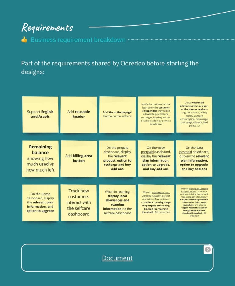
Miro board with some of the requirements and a link to the full scope
The results
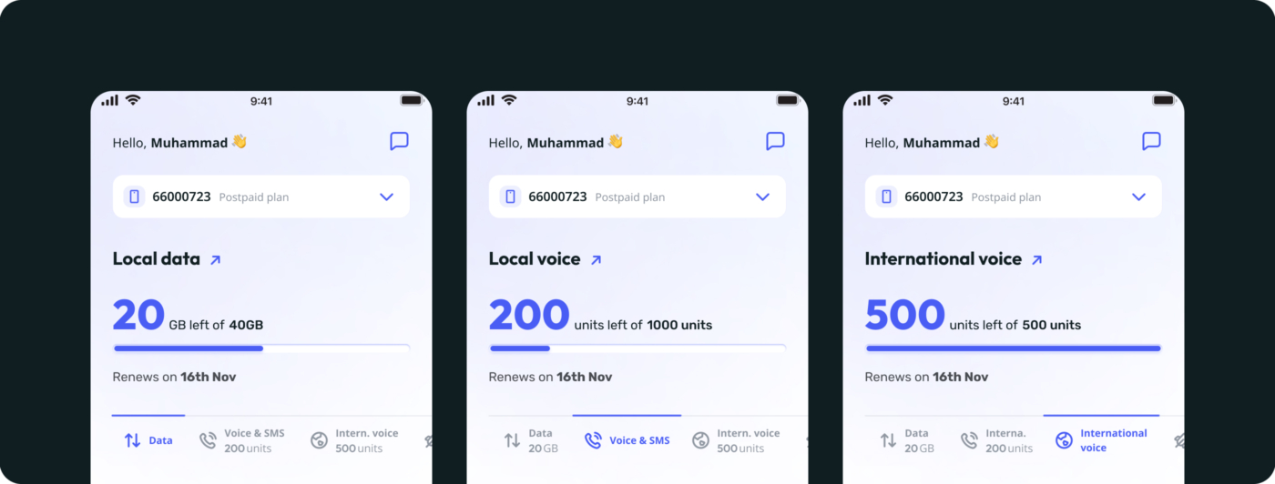
Allowances section showing: 1. Local Data, 2. Local Voice & SMS, 3. International voice
Their As-is solution shows all the Allowances inside a Carousel, taking a considerable space on the main page.
The client wished to avoid this in the new solution and wanted to show all allowances immediately, without the need for an interaction. Also, considering benchmarking analysis we came to the conclusion that many telecom companies also do it and load them all at once.
So, to avoid having the interface overwhelmingly loaded with text, I decided to show one allowance at once, but kept a small indication of the available amount of other allowances visible inside the tabs.
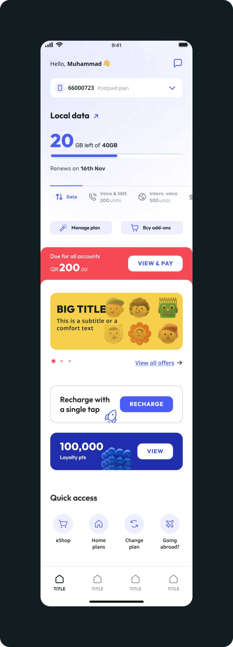
Dashboard [App / Mobile]
A fun interface
The big number highlighted, the tabs to navigate between allowances and the reduction and desaturation of many graphical elements create a much needed hierarchy of elements that help the user focus their attention and find the information they want.
One of the goals we aimed to achieve was to turn this journey into an ‘attractive’ and ‘fun’ experience.
This meant making the page as less static as possible, by adding subtle animations at certain points of navigation (not all at once, otherwise it would become overwhelming).
For example, after the splashscreen:
the logo ‘flies’, reduces and becomes a prefix of the welcome message;
the blue graphical line (representing the available allowance) loads starting with a full width, decreasing to the specific available percentage;
the rocket icon (inside the recharge card) does a quick loop - although the animation starts only when it is visible inside the viewport, or at a certain y percentage in case it was already visible during loading;
the loyalty points go around like a slot machine until they reach the total amount available - between others.
The whole process was quite the challenge, and the result mirrors that, as there’s a visual difference between this page and the others that had been created before.
Anyway, I was pleased with the final result, considering all the limitations and technical / visual requirements that existed.
To infinity and beyond!
Toy Story, 1995
Testing our designs
One of the privileges of working in this project and with this client, is the value they give to the input from users. This allowed us to perform User testing for each epic done. Our team was onsite for several weeks, with well structured scripts and functioning prototypes (for mobile and desktop) and great feedback was collected.
For all epics most tasks were completed without an issue, but we both Billing and Dashboard there was one exception - the line graph from the Monthly Credit and the Allowances sections. The way we read these type of graphs has a lot to do with cultural background and more specifically, with visual language - Arabic speakers for instance, read it opposite to western people (as they also write from right to left.). What for me, a western and latin / english speaker is clearly a graph increasing from left to right, doesn't make sense for an Arabic native. And although the Portal exists in Arabic too, we need to cater the needs of all our real end users.