Jawwy, Saudi Arabia, 2020 / 21
A brief intro
The challenge
This was one of the biggest projects I have been involved in, but one of the most interesting ones.
The goal was to do a complete revamp of Jawwy’s selfcare portal for Web and App - Light and Dark mode. I arrived during prototyping phase: features, IA and low fidelity prototypes were already created.
So I started as the lead UI, along with a junior designer - the goal was to create the new User Interface from scratch.
Role & Task
Lead UI - creation of the Design System
Scope
Web & App
Software
Figma
First steps
The initial research
I started by researching existing libraries, website and any material that showed me how the brand was used.
I did start with some material to work with, but it was incomplete and had to be updated.
I could use colors, typography and some icons but not much more.
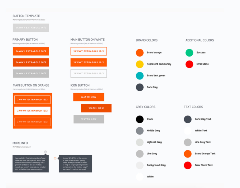
Jawwy's official library snippet
New library with core elements
Setting up the baseline
Patterns in typography and colour were identified first: e.g.: orange for primary actions, blue for active states and teal green for secondary actions.
Next, I copied their typography library and adapted it (created a rule to minimize by 4pts all H1 and H2 and 2pts all the rest) for smaller screen sizes.
Icons and illustrations were elements to be created later, so for now placeholder icons were fine to be used.
Getting ready
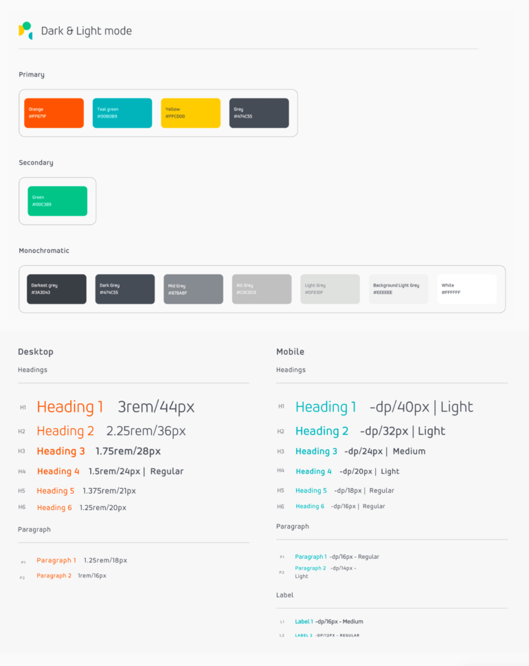
Since we were starting with App in Dark mode (it had priority in the delivery plan), the color correspondence from dark to light had to be established, to automate interchangeability.
Regarding accessibility, contrast tests were done to ensure colors followed the correct standards, but unfortunately, due to brand limitations, some primary colors could not be adjusted for dark mode (in order to fit the WCAG criteria). We just had to be careful to not use these colors with small text elements.
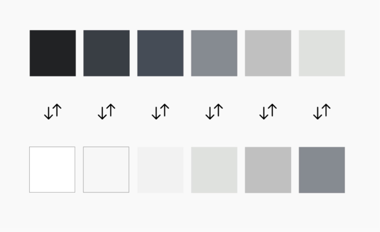
Dark & light correspondence
Design System basics
Going native
Some of the first elements I added were native components such as the keyboard and the notch for iPhone).
These do not impact the Design System but are needed to understand how much space is available on screen. I always advocate to simulate the smallest screen size first.
Using an Atomic design approach, all structural elements were drawn: full width backgrounds, cards, and overlays.
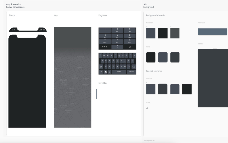
New library with native / baseline elements
Navigation
Navigation in the App was defined on start.
First, secondary and third level layouts were drawn and the bottom menu was also created.
With colors ✅ and typography ✅ already in the core library, we were ready to continue creating the following components. Although typography was established, I had to find a way to recreate patterns so objects would be consistent.
For example: all subheadings in the platform would be named 'P1' and labels had to be added to the library named as 'L3', UPPERCASE and Bold, 12pts.
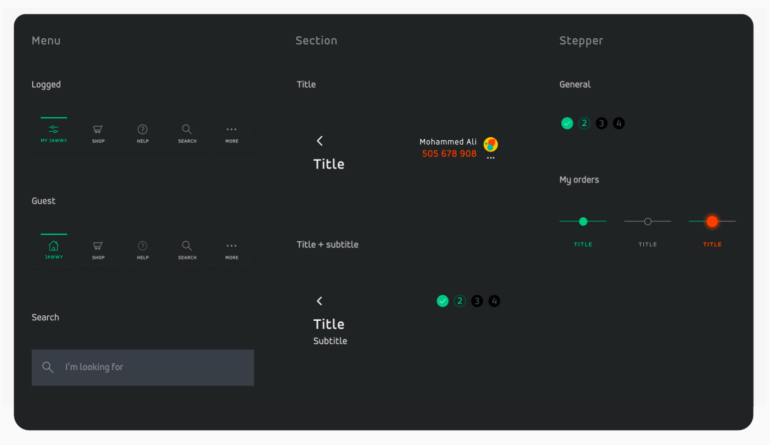
Navigation components (App, dark mode)
Atoms, molecules & organisms
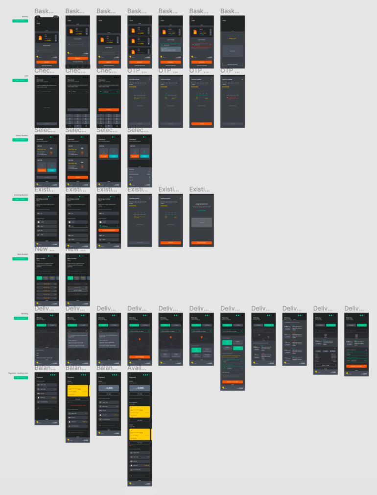
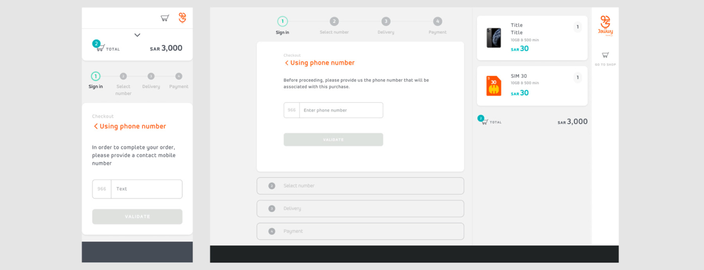
The first pages created were of a Checkout process.
With a full page to work with, we could break it down into smaller components, like forms, steppers, links or buttons; then move to medium - product listing, counter, options and price tag; and finally larger - basket and variant (collapsed basket) components. This systematic approach was later applied for Web desktop and responsive views, and became easier to work with as the library was becoming "fuller". Yet, still a lot of work had to be done to keep patterns consistent while new components were being created.
At this stage, the layout grid was also defined: 3 columns with a 15px gutter and 30px on both margins for responsive web.
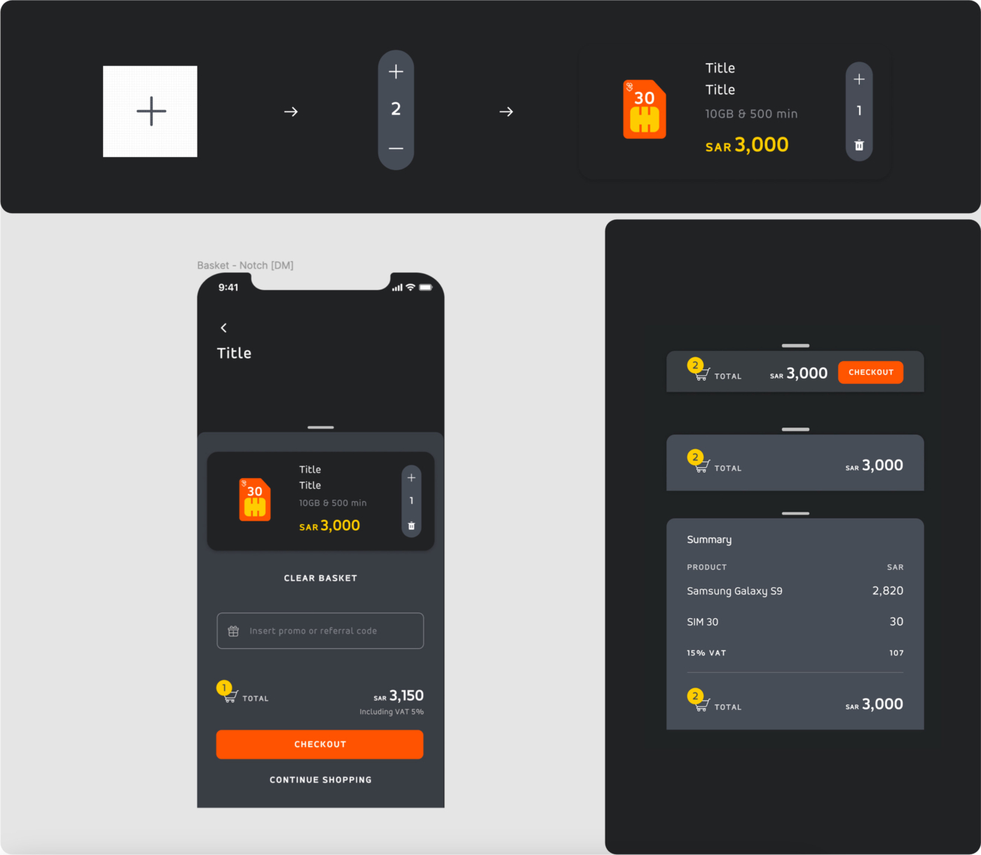
Example of an Atom, a Molecule and Organisms from the Checkout journey
Pages and pages
The list of pages was long and challenging. It included a Shop, a Dashboard and tasks to be completed. But the process was the same for all - start with the smallest elements and build up from there until entire pages are done.
As the mobile App was being designed in Dark & Light mode, a version for web was also coming to life.
Checkout pages in App - dark
Let creativity run wild
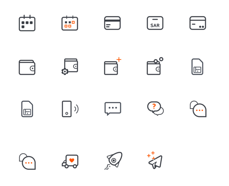
As pages were being refined, I started looking into the illustrations and the entire iconography. This is something I really enjoy doing, if there is enough time.
And time was a challenge, I would even say that the major challenge for this project was the shortage of it. Time to create, time to organize, time to test and time to validate.
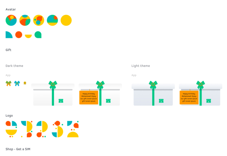
Illustrations & icons created during this project
Any more challenges?
Mistakes were made during set up. The bad approach was to start designing Desktop instead of Mobile (had to do with management, but I should’ve underlined the importance of a mobile first approach). And jumping to Desktop was even more challenging - things just seemed too big and out of place. Since Desktop became so different, its Responsive version
differed as well.
We realized this on time, but I had to lose some time recreating screens
to reuse App components.

Coming to life
With components created 🎉, entire screens soon came to life.
Bellow is a selection of a few of those:
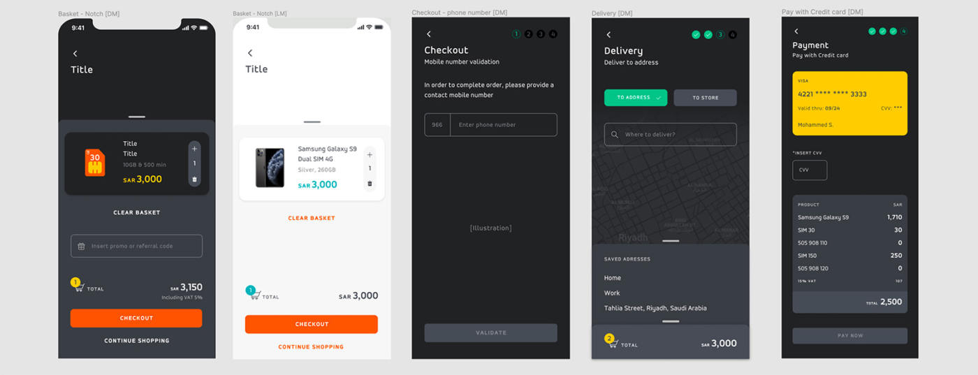
Basket & Checkout App - dark & light
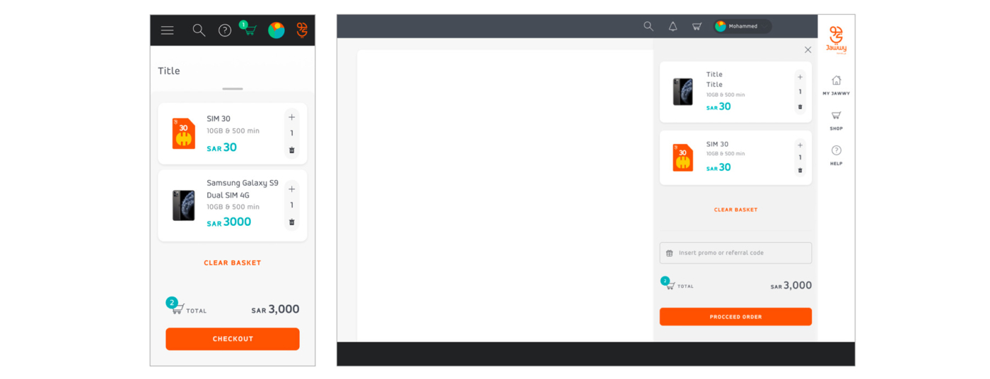
Basket & Checkout Web
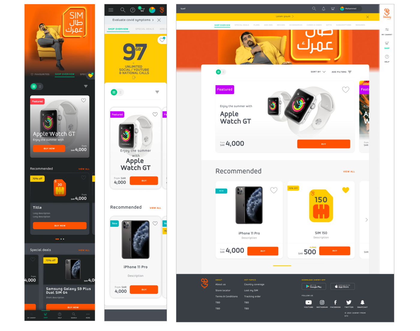
Shop App & Web
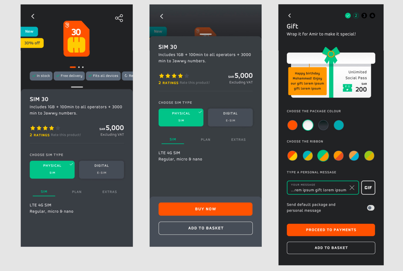
Product detail App - dark
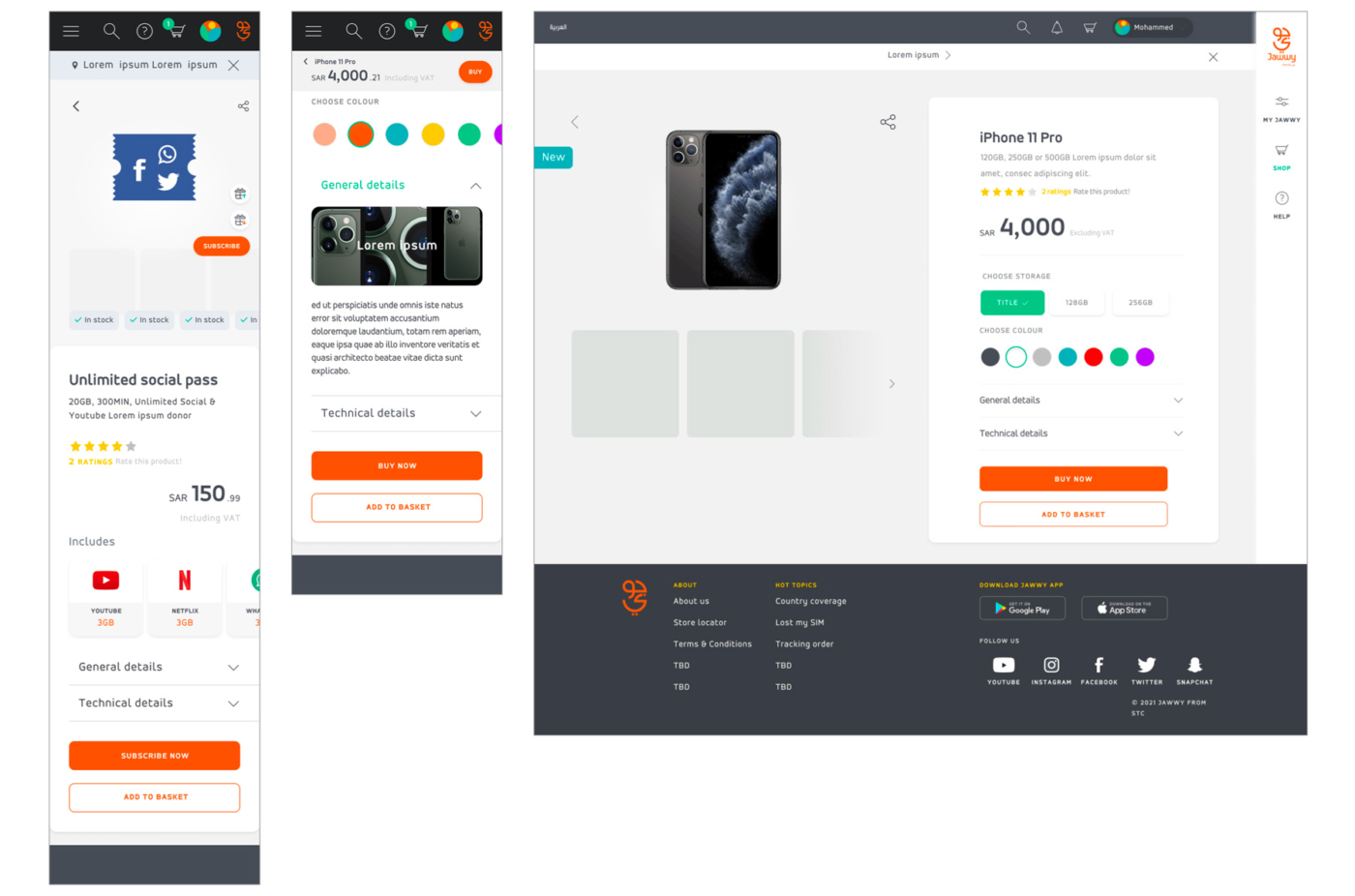
Product detail Web
Yes, this should be a quote
And this should be the quote citation