Sign up
Introduction
The Onboarding was the first epic designed. The existing sign up flow was quite basic - a single page with a form to fill out and a button. Yet this seemingly simple process can be made into a fun and pleasant experience, with some key adjustments: breaking down tasks into different steps, improving the copy and adding friendly iconography. This will make the entire process much easier and enticing for the user.
Below you will find some of many key practices I follow(ed) to ensure that what is drawn fits the criteria for good design and accessible experience for most users:
1.Start
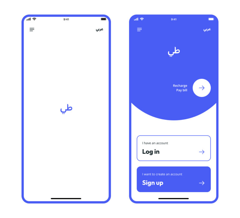
Splashscreen & Entry point
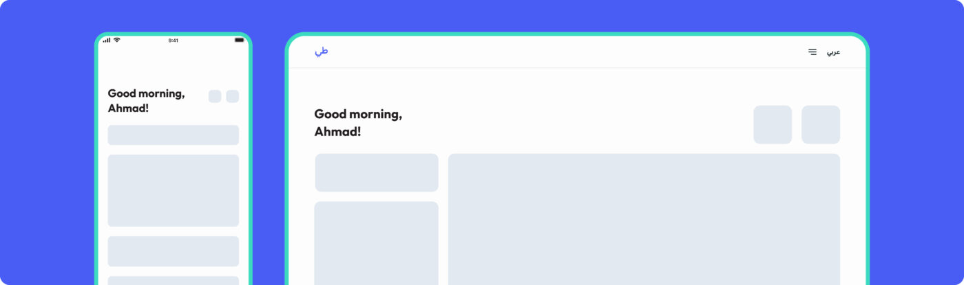
Designs for mobile are created considering a smaller device - 375 x 812. This way there is more control over content.
Creating a balanced distribution of white space and simplicity of shapes reduces cognitive load, thus minimizing mental effort when the user is completing a task.
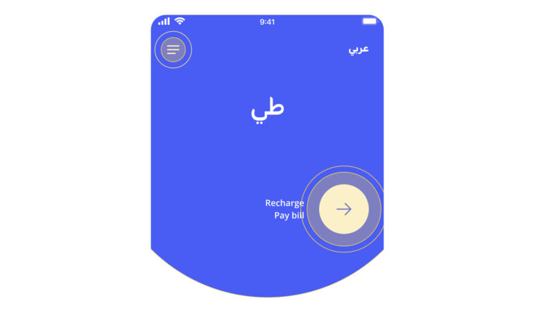
Quick Access & Quick Recharge or Pay bill entry points
2.
Tab bar options
Two additional requirements were to design the flow for Anonymous users to either Recharge or have immediate access to a set of options. The challenge was to make these options clear enough without hindering the clarity of the main flow.
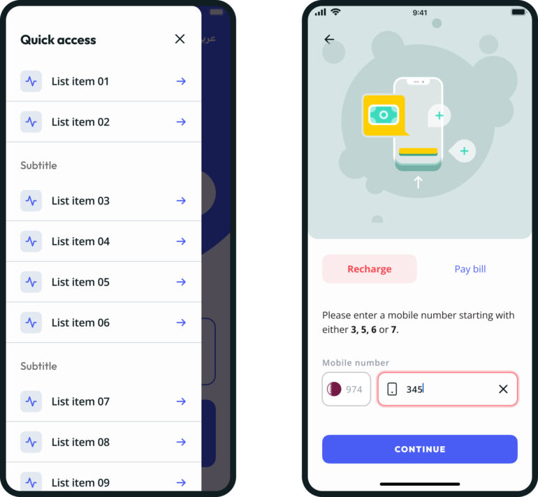
Quick Access & Quick Recharge or Pay bill
Listed menus are a nice scalable option for different entry points, as they can be added or removed without breaking the navigation. Icons can be used to identify and differentiate options.
Fitts’s law states that large and closer elements are easier to interact with: the content and button sticky to the bottom of the screen, play as an anchor to aid the user to know what to do.
Visual hierarchy is ensured by reorganising the content into segmented areas, making it less overwhelming when there are many options to filter from.
Progressive disclosure is the reduction of the amount of immediate actions presented to the user. This makes the user less overwhelmed when entering the App, reducing churn.
3.
Register with
Von Restorff Effect states that users tend to notice objects that stand out more. This was useful as there was a business requirement to push users to register primarily with mobile number.
A Color system is used to identify actions and status: a separation is created between ‘actionable’ and static colors, the brand primary blue is used for primary ‘call to actions’ and pink to highlight selected objects.
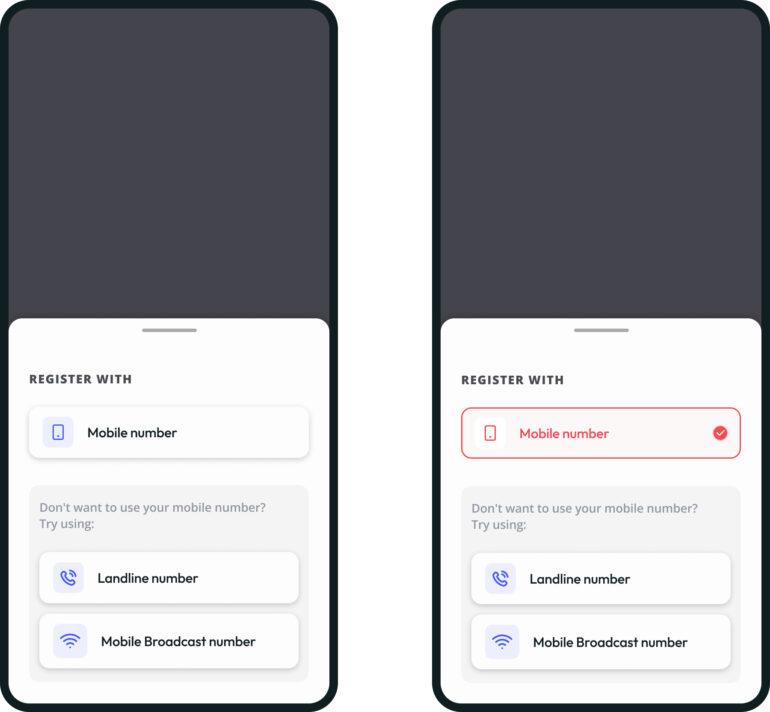
Registration options
4.
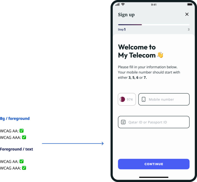
Sign up - step 01
The process is broken into steps, showing the user progress, and each step numbered shows him/her exactly how much there is left.
Each step or page is titled, offering context.
Clear content, and the use of white space allows the user to focus on the main task.
Floating labels (input fields) are the best way to reduce the amount of text in a single page.
Color contrast tests are done as the components and specific copy are built.
Color is used to map actions and different status - here, green is immediately shown for input field validation. The check icon has the same purpose for users with limited color perception.
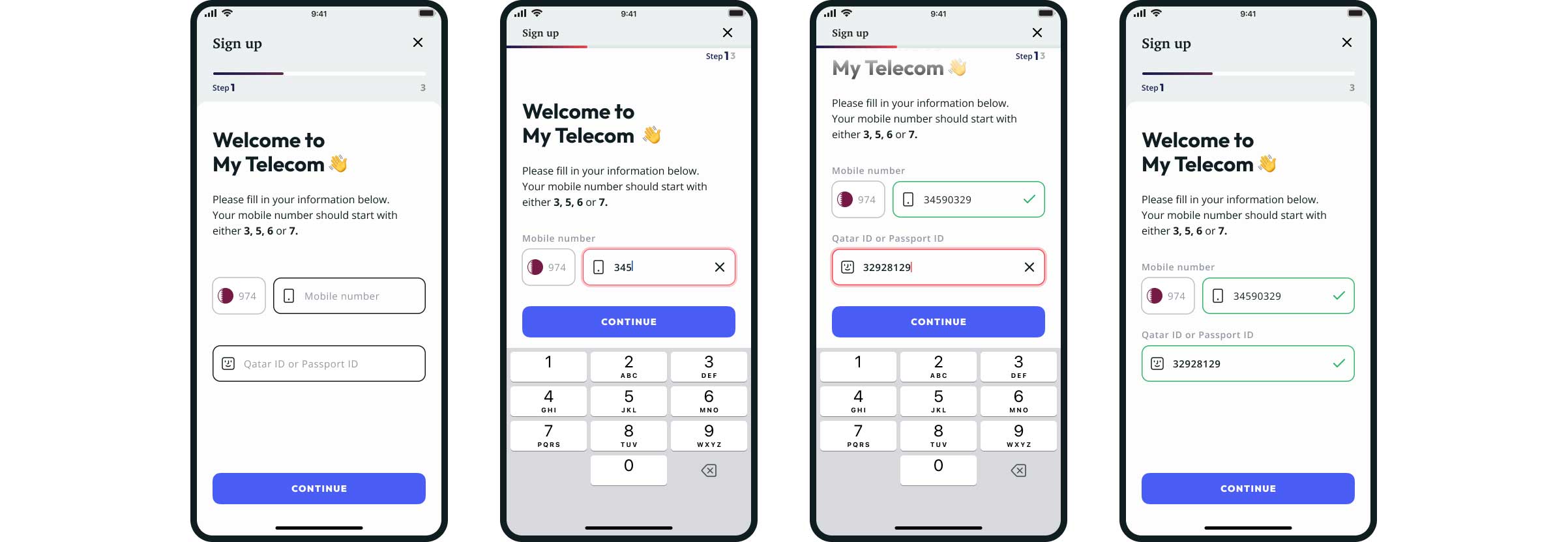
Step by step flow with static & focused content, keyboard open and scrolled page
5.
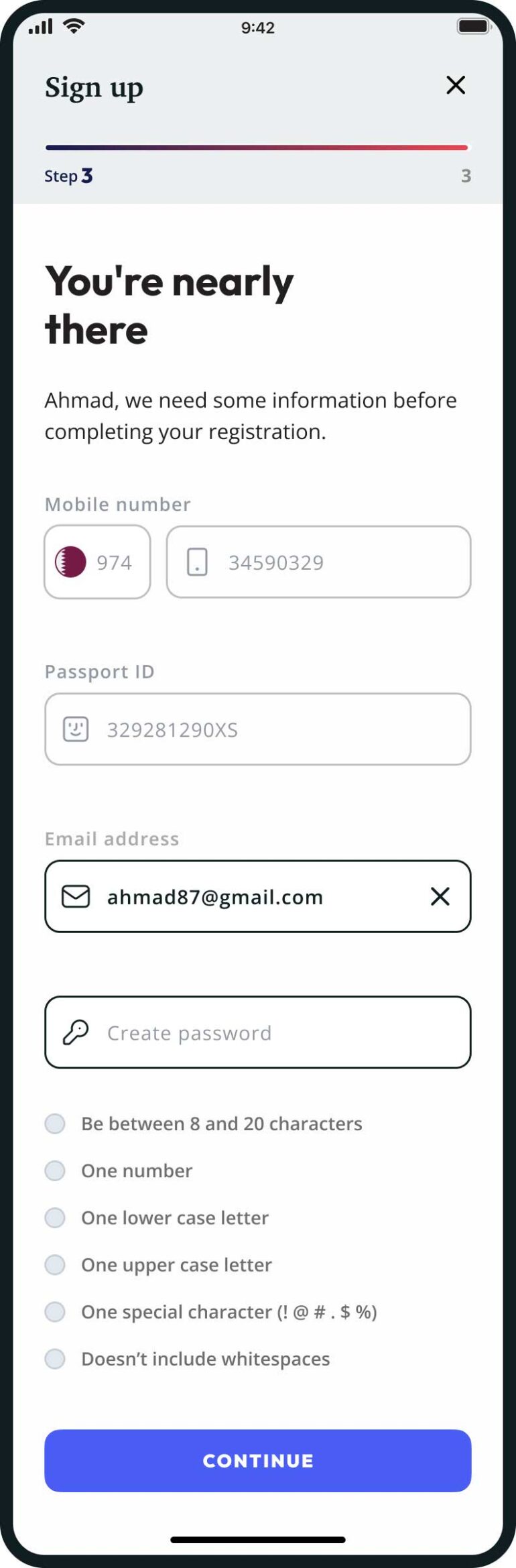
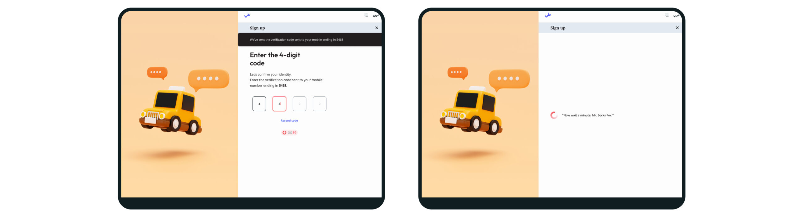
Sign up - Step 02
Full form page: taking advantage of mobile devices by optimizing the interface, like auto-fill and input suggestion allows for an easier process in a device that is usually hard to type for many users. Transitions from one field to the next and from one step should be automatic too.
OTP validation page: the toast message is temporary and the choice of contrasting colors and a sliding animation helps highlighting the action.
Loading page: labor illusion makes users to feel valued. Because they have just completed the required task, understanding that this information is being ‘processed’, makes it seem 'worth the work'. Loading times can be used through the entire app with this benefit, and loader animation make it clear that something is ‘under progress’.
Full form
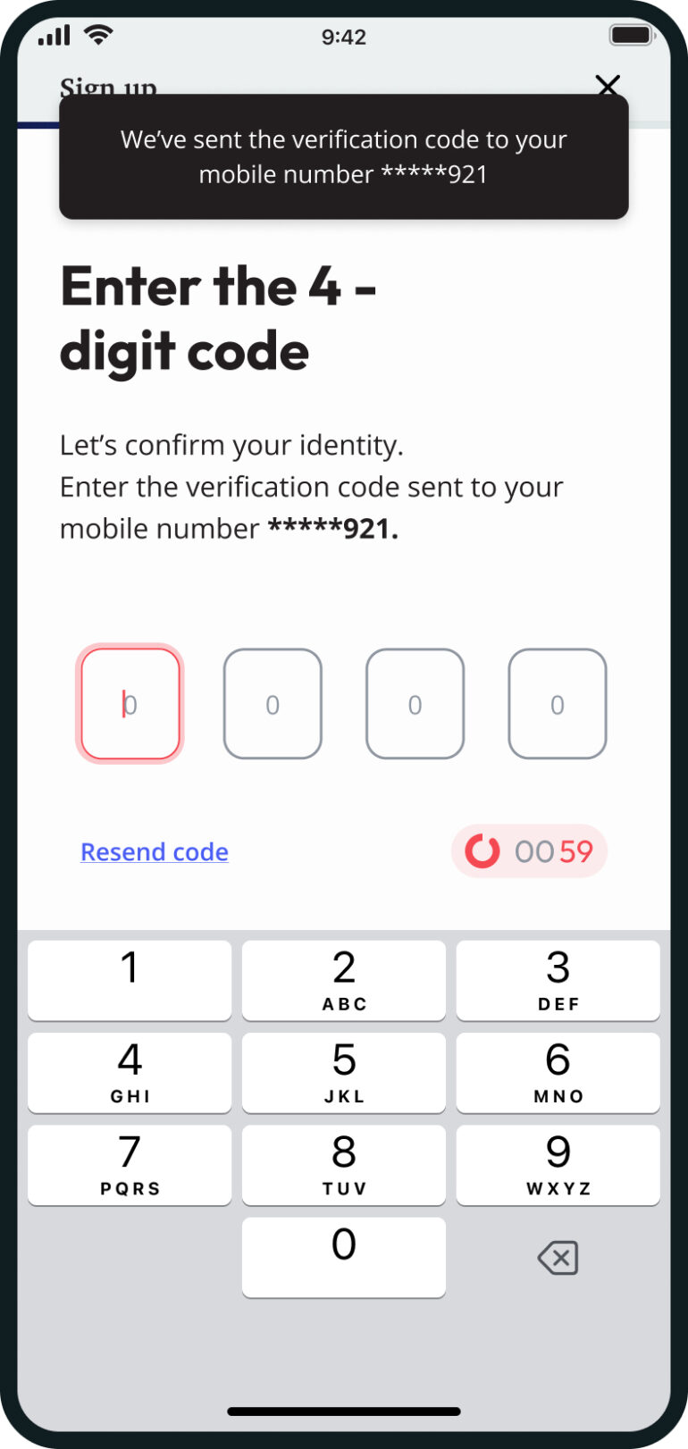
OTP validation
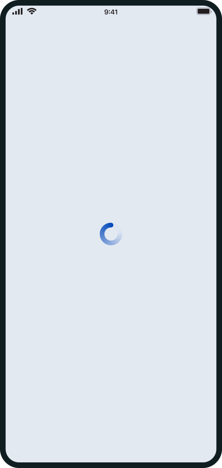
Loading

Success!
A big illustration will help support the message being transmitted and adds to the structure if there is less content.
Login
Introduction
Login started along with the Sign up journey. It is a smaller journey with a single page to design. Still, it came with the addition of the ‘forgot password’ feature, which redirected the user to a second 2-step journey.
The challenge
The biggest challenge with this epic was the Desktop view. With any project, we ideally follow a mobile-first approach: designing for the smallest screen first and grow from there. Luckily this project was no exception. So, our entry point for entering the App was quite simple - a logo, a single button for Login and another for Sign up.
Login journey & skeleton loading example [App and web mobile]
But it didn't make sense to have the same layout for Desktop (and Tablet Landscape) since there’s enough space to add more elements in the same page. So, the decision was to keep the Login form immediately available on the page, thus eliminating the double click to enter the portal (also, having two big buttons didn’t look good at all!). After confirming with our UI Devs, the solution seemed simple enough - something like having the desktop login form inside a div that was hidden according with specific display size tiers. The reverse would apply to the big App buttons, that would hide when the viewport reached a bigger resolution.
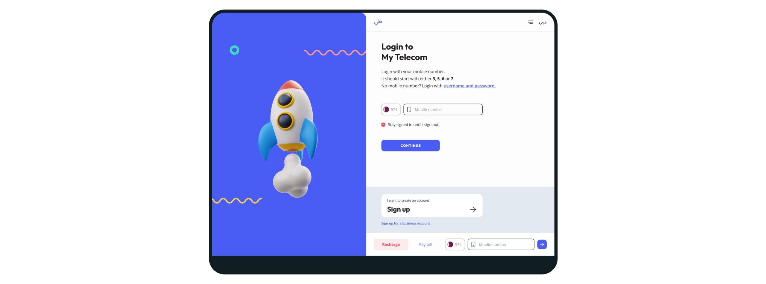
Login journey [web Desktop]
Responsiveness and the Checkbox
Having to create different layouts for different sized viewports requires some notions of a real usage of a device. This was a good training, and I had fun creating two variants of the same component.
One aspect to consider is the size of a cursor vs the size of a finger. This is why choices were made to keep the buttons sticky to the bottom for mobile devices, and adding tooltips for desktop views.
One of the first variants created was the Checkbox. The checkbox itself doesn’t look different from device to device, but the interaction does: a mouse has a much smaller touch area than a finger, besides showing an more immediate feedback when the mouse passes over the element.
Considering this, it makes more sense to have a full component interaction on the mobile version - making it look and behave more like a button by allowing the selection if the user taps any part of the component background.
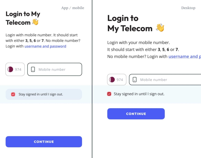
Sign up & Login layout example [web Desktop]
That's no ordinary rabbit. That's the most foul, cruel and bad tempered rodent you ever set eyes on!
Monty Phyton and The Holy Grail