Setting up the Design System
Introduction
As the UI designer, as soon as I entered the project I set up myself to create all the baseline for the new Design System. I had a green card to start it from scratch, considering there was virtually nothing set yet.
I have my own approach when starting creating a Design System, which helps me organize effectively all the basics of every new component created that moment onwards. Luckily I was able to keep the same process here, considering the short timelines.
1.
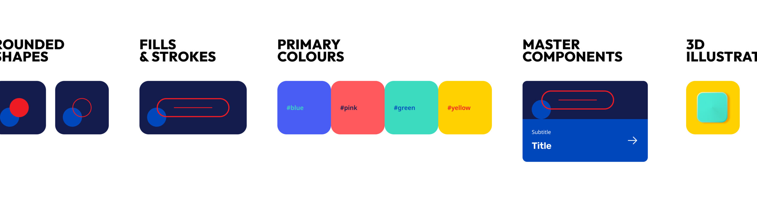
Colors & fonts
For colors and fonts, the goal is to end up with a consistent library that will cover 99% of the needs of the project’s UI. The 1% is expected to appear during the project, in case there’s any third party element that should be represented in the UI, like a logo or a specific layout (for e.g.: in this project there was the need to create a look & feel for premium customers, with dark and gold tones).
Colors are usually documented in client's own brand guidelines. I also visit the official website to search for any neutral tones for the background or other structural elements, as these are usually not part of the defined brand system. For fonts the same applies - in case the guidelines are sparse and there’s not much indication of size hierarchy, an inspection of the website will help me understand the rules for typography.
Primary colors inside the DS
2.
Buttons & basic components
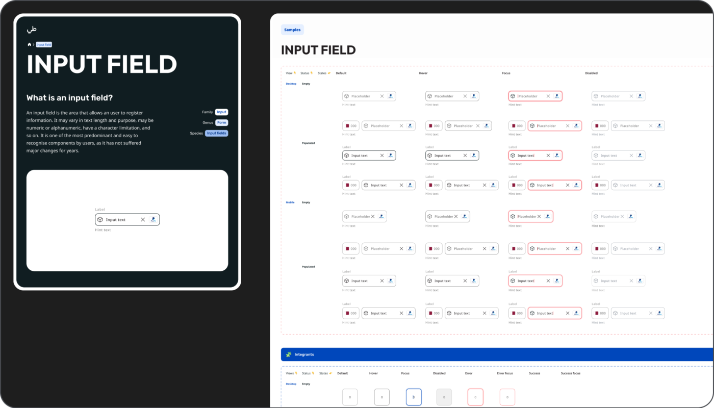
I search for every component I see consistently throughout the official channels, such as buttons, tabs, even line dividers, etc. These elements I find more difficult to update drastically, as they give the brand some of their look and feel. The radius of elements is also an aspect that immensely contributes to the look & feel. So those that will not suffer a major change are documented in the DS right away; Input fields are considered an exception, as I believe they are always being improved and updated along with new findings, as they are also technically more complex.
The official logo is also made into a symbol, preferably with the permitted colors schemes as different properties. Other mobile native elements such as keyboards, status bars or even browser navigation tabs can be added as a means to facilitate the process when needed. For these I usually grab something from the Figma community and the amazing contributions other people do. If there is no time to design icons, I also resort to shared libraries, as it saves a lot of time and quality is usually not an issue.
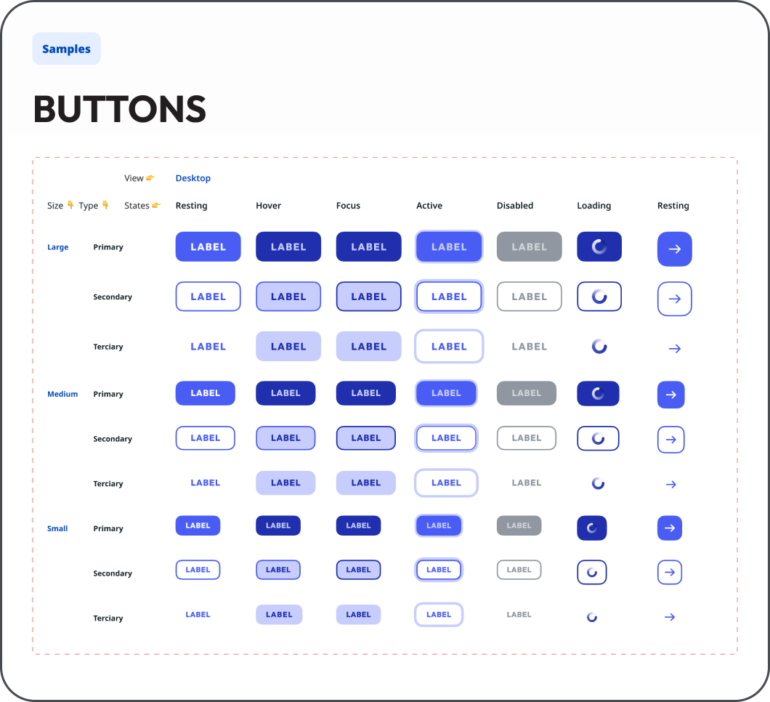
Buttons inside the Design System
3.
Layout & navigation
After official styling and core elements are put together, then it is time to start defining the skeleton - setting up the grid and responsiveness.
A baseline structure needs to be defined. This will determine the App’s core ecosystem and skeleton. By doing this, I am establishing a logic to the navigation and thus turning any task into a narrative.
First, secondary (and tertiary) levels and modal views (with first and secondary levels) are defined, specially through components like the Navigation bar and the Tab bar. These are elements that need to be dynamic: they need to be less invasive as possible, and yet, present inside all screens.
During processes with several steps to complete, (such as Register or Login), all primary actions should be available as full-width buttons sticky to the bottom of the screen (easy to reach).
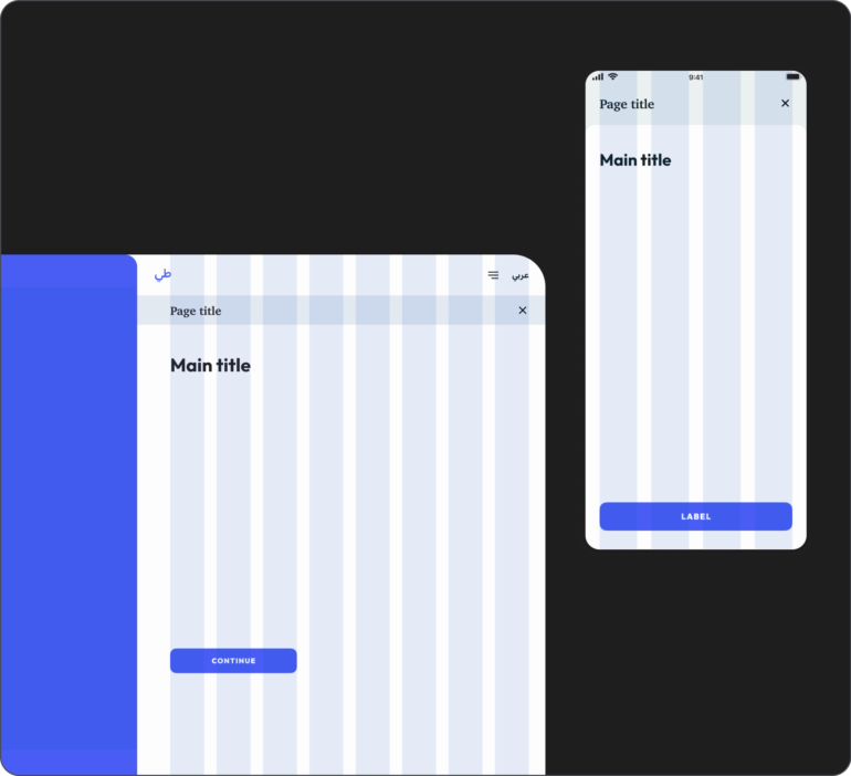
Screen templates with diferent levels of navigation
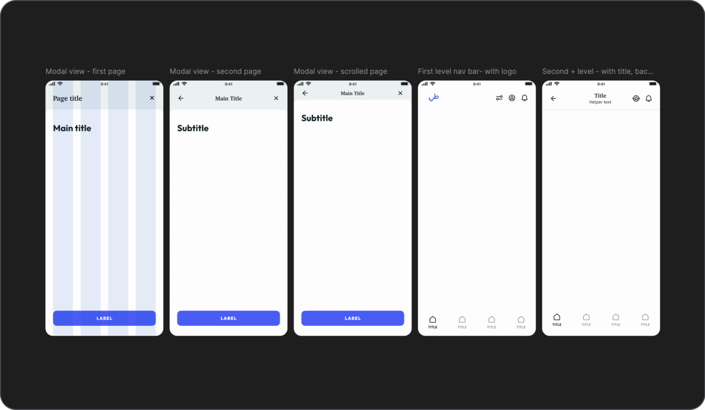
Setting up of different page levels
4.
Figma Libraries
These contents are then added to different libraries in Figma - this is always a learning step, as there's always an improvement to be done. It will also vary from project to project, as it depends on it’s size, needs and even which teams will need access.
I followed the 'atomic' design rule for some time but with a few adjustments: the logic is still the same, components grow from the smallest to the biggest element, but the way they are organized differs. I am, again, still improving this process and I am yet to find an ideal solution, if there’s any.
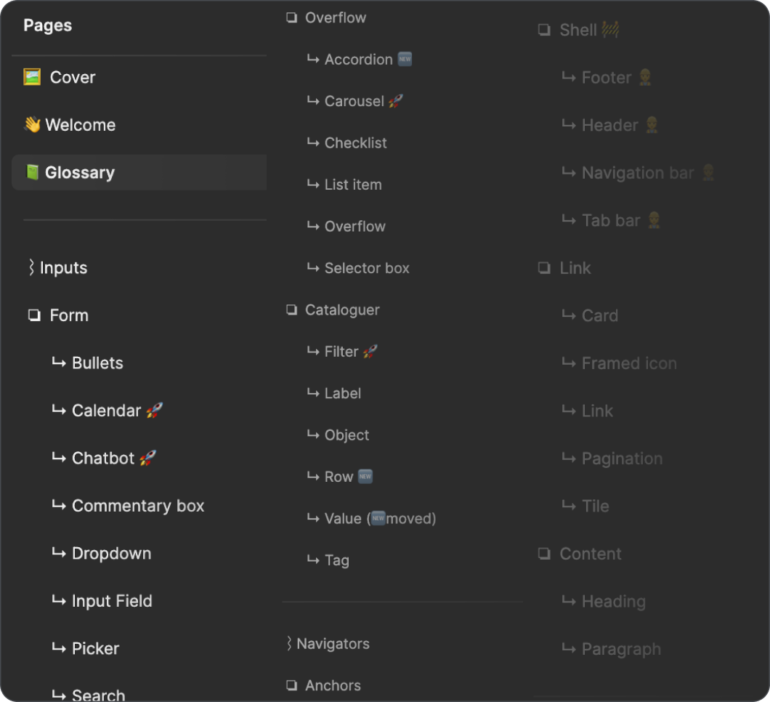
List of components inside Figma
For symbols or master components, every time a new component is added all possible statuses are also created. This way there is a lot of material created right from the start, which will be a great starting point for development teams to start early:
Example of how a component is documented: in this case the Button
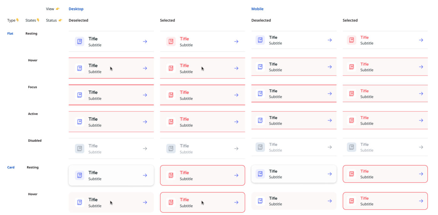
Example of the Selector Box component with all different statuses
5.
Naming
Keeping a house clean and organized is important for our general health, so why not do the same for our files? I find that naming and layer organization is very important, as it ensures that everything is easy to find inside the same page, and that there’s a logic for positioning the elements. Specially with auto-layout, where there’s a similar logic for placing elements as there is with CSS position property, so it only makes sense for the naming to go along.
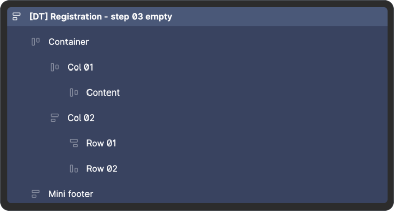
Contents inside artboard
Okay, let's go
Dutch Meme Kid
A Design System is a tool that is always under construction. But setting a strong baseline from the start is fundamental in creating an efficient design process. Not only guarantees consistency in look & feel but also in the behavioral patterns and navigation, speeding up the entire design process while ensuring the best quality. For this project even though there was not much time in the beginning I was able to prepare a lot of material before starting the journey’s UI.